In the world of graphic design, scale is a luxury. When you are designing a billboard, a full-page magazine spread, or a desktop website layout, you have room to breathe. White space is abundant. If a line of text is slightly misaligned, the sheer size of the canvas often masks the imperfection.
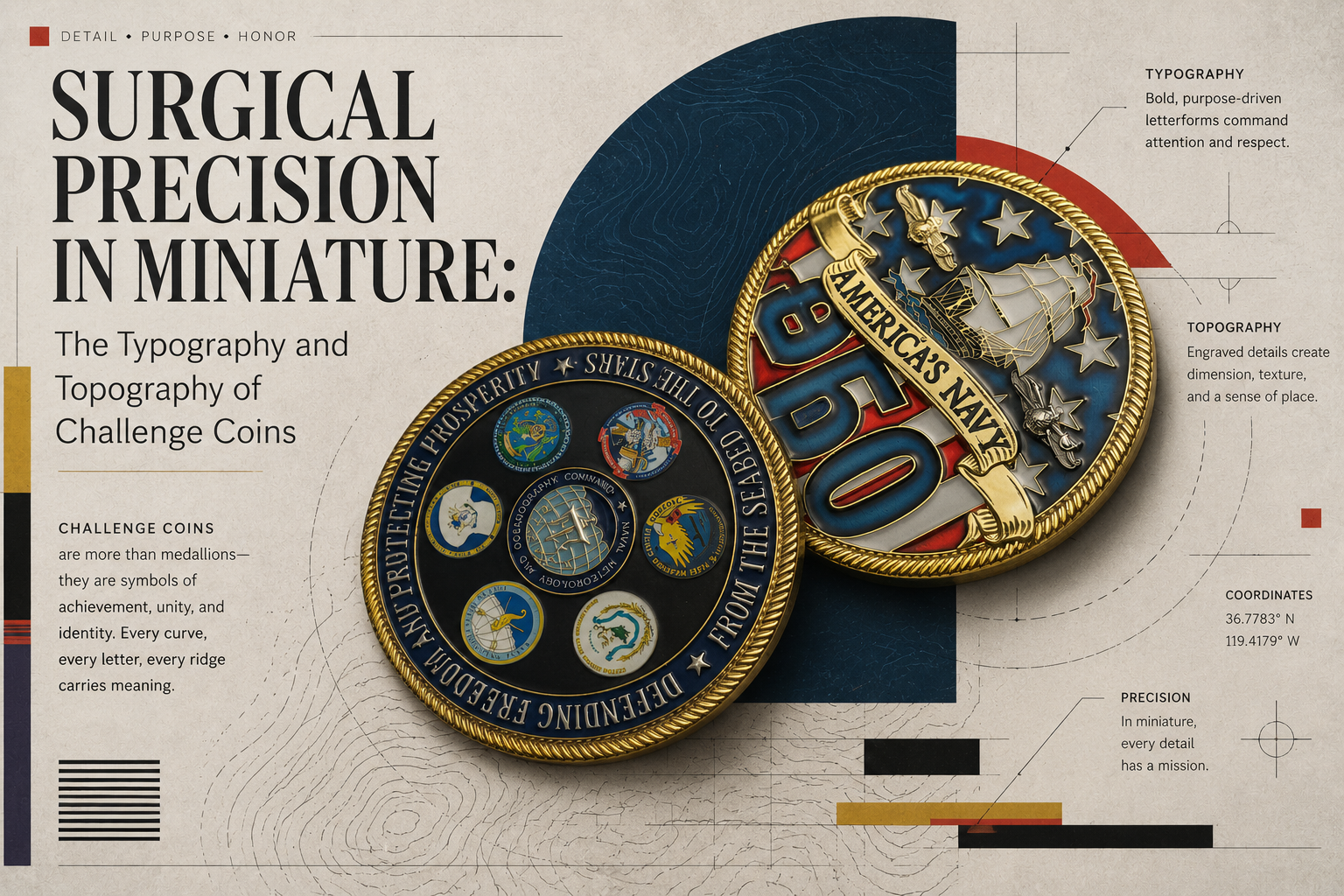
Now, imagine stripping away all of that space. Imagine condensing your entire visual narrative into a heavy, metallic circle. The typical standard canvas is a mere 1.75 inches across, while a 2-inch diameter serves as the common “heavy” upgrade.
Designing for this medium requires an absolute mastery of spatial awareness. It is an exercise in surgical precision. Designing a bespoke challenge coin is not simply a matter of shrinking a logo and pressing print. It is the complex art of translating flat, two-dimensional vectors into three-dimensional bas-relief sculptures.
Here is a look inside the extreme constraints, the topographic challenges, and the typographical nightmares of designing for one of the smallest, most unforgiving canvases in the art world.
The Necessity of the Blank Page
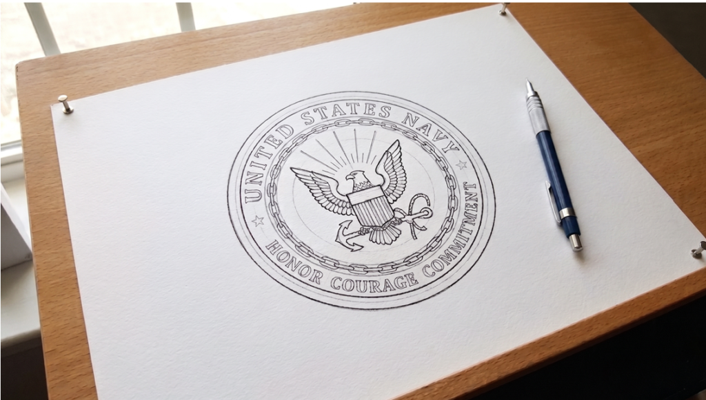
When dealing with a canvas measuring under two inches, there is absolutely no room for compromise. This is why true artisans in the numismatic design space refuse to use pre-made templates.
A template forces a designer to shoehorn custom artwork into predetermined borders, generic ribbons, or standard rope edges. In miniature design, even a fraction of a millimeter of visual friction is obvious. A heavy, generic border can instantly suffocate the focal point of the artwork.
To achieve a 100% bespoke design, the process must begin with an entirely blank page. The outer edge, the typography, and the central emblem must be designed holistically. They have to flow together organically. Starting from a blank digital canvas allows the designer to control the narrative of the coin from the very first vector line, ensuring that the negative space is just as deliberate as the raised metal.
The Nightmare of Circular Kerning
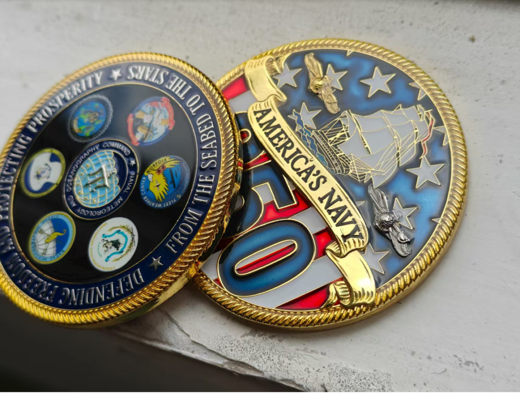
Typography is arguably the most difficult element of miniature metal design. In standard digital layouts, fonts are designed to sit on a flat, horizontal baseline. But coins demand that text wraps around tight, circular perimeters.
When you bend a word around a curve, the underlying math of the font breaks down. The outer edges of the letters fan out, creating massive visual gaps, while the inner baselines compress and crash into one another.
To solve this, designers cannot rely on automated software metrics. They must use optical kerning. This means adjusting the space between every single letter by eye to account for the curve. Furthermore, standard serif fonts are notoriously difficult to work with in this medium. The delicate “tails” and flourishes of a serif font tend to bleed together when stamped into brass or copper. For optimal legibility at a 4-point or 5-point size, designers lean heavily on clean, robust sans-serif typefaces.
Translating 2D Vectors into 3D Topography
Designing a coin means designing for the Z-axis. A digital screen is perfectly flat, but a coin is a multi-level topographic map. The designer must constantly calculate how light and shadow will interact with the physical metal.
This process, known as bas-relief sculpting, requires balancing positive and negative space. If a design is too cluttered with raised elements, it loses all definition. When struck by the minting press, an overcrowded design simply merges together into an illegible, muddy mass often referred to in the industry as a “metal blob.”
To prevent this, the designer must employ numismatic contrast. They strategically leave wide areas of recessed metal (the background) to allow the raised, polished elements (the artwork) to physically stand out.

Additionally, designers must account for “draft angles.” When the heavy steel die strikes the raw brass or copper blank with hundreds of tons of pressure, the metal is forced into the microscopic cavities of the mold. If the edges of the 3D design are perfectly vertical, the coin will get stuck in the mold, and the artwork will shear off when removed. Therefore, every raised element must be engineered with a subtle 5-degree slope, allowing the final artifact to release cleanly from the press.
The Hard Limits of Heavy Metal
In the digital realm, an artist can zoom in infinitely. You can draw a line that is a fraction of a pixel wide. But in the physical realm, the medium fights back.
Brass, copper, and black nickel have hard physical limits. The absolute minimum line thickness that can be reliably struck into metal is 0.2 millimeters. Anything thinner will simply vanish under the immense pressure of the minting press. If a design includes recessed areas meant to hold colorful enamel, those dividing lines must be even thinner—around 0.15 millimeters, to ensure the paint does not bleed across the canvas.
The designer must constantly translate their digital vision through the lens of industrial manufacturing. They have to strip away the unnecessary, thicken the essential, and distill the artwork down to its purest, boldest form.
A Masterpiece of Constraint
Ultimately, the beauty of a custom coin lies in its constraints. It demands that the designer strip away the noise. There are no gradients to hide behind and no expansive white space to balance a weak composition.
When you hold a well-designed coin, you are holding the result of ruthless editing, mathematical typography, and microscopic architectural planning. It proves that sometimes, the most profound pieces of design are the ones that fit perfectly in the palm of your hand.