There are visual styles that announce themselves noisily, with speed lines, shadows, splashes of ink, and enough graphic aggression to make subtlety look like cowardice. Then there is ligne claire, a style so poised, so apparently calm, that it can be mistaken for ease by anyone not paying close attention. That mistake is understandable. The clean line has always excelled at making difficulty look natural. But beneath that serenity lies one of the most disciplined and influential visual languages in the history of comics.
Associated above all with Hergé and The Adventures of Tintin, ligne claire is more than a technical method. It is a philosophy of legibility. It assumes that the world, no matter how crowded or chaotic, can be drawn clearly enough to be understood. In an era addicted to visual noise, that confidence feels almost utopian.
1. What Is Ligne Claire?

The term ligne claire — literally “clear line” — is usually used to describe a style of drawing in which forms are outlined with clean, even contours, colors are kept relatively flat, shading is used sparingly, and every object in the image remains sharply legible. There is little of the expressive scratchiness associated with underground comics, little of the painterly turbulence that later graphic novels would cultivate, and almost none of the visual clutter that superhero comics often mistake for energy. Instead, ligne claire produces an image in which foreground and background coexist with remarkable compositional dignity. A car, a window, a hand, a dog, a ship, an entire city block — all are granted visual clarity, as though the world itself had agreed to be readable.
That readability is not merely decorative. It is structural. In the best examples of ligne claire, the reader never struggles to understand where the eye should go or what information matters. Panels are cleanly organized, environments are described with architectural precision, and the narrative unfolds with a confidence that can feel almost effortless. This is one reason the style has remained so influential: it treats visual storytelling not as a battlefield of effects, but as a craft of lucid arrangement.
What makes the style especially fascinating is the paradox at its center. It appears simple, but its simplicity is highly manufactured. A line that looks “natural” on the page is often the result of tremendous control. A background that feels light and airy may have been built from painstaking observation. Ligne claire is therefore not minimalism in the casual sense. It is refinement. It removes visual confusion without erasing visual richness.
In that respect, the clean line feels less like a genre convention and more like an ethic. It assumes that complexity does not need to be dramatized in order to be communicated. It can be ordered, distilled, and rendered intelligible. If one wanted to be slightly grandiose — and art writing occasionally permits such indulgences — one could say that ligne claire is the dream that the world might still be made legible through drawing.
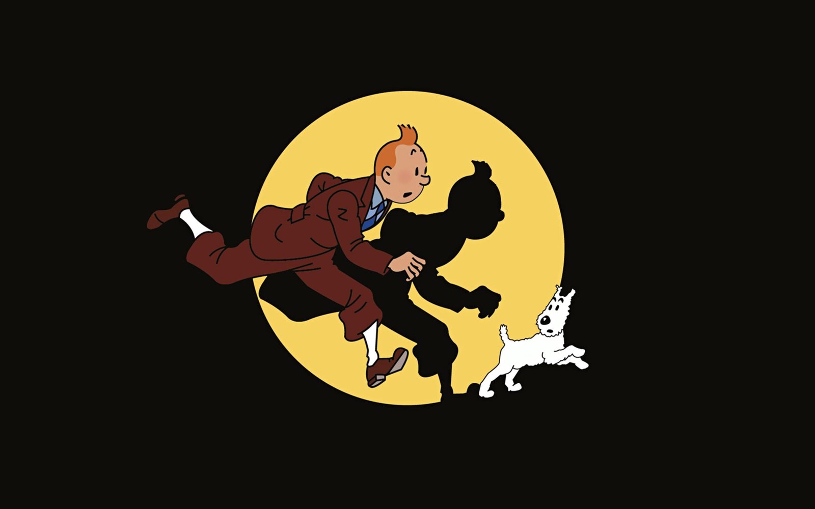
2. Hergé and the Birth of a Visual Discipline

Although the language of ligne claire did not materialize from thin air, Hergé remains the artist most closely associated with its codification and perfection. Through The Adventures of Tintin, he transformed a set of stylistic tendencies into a coherent and widely recognizable visual system. His pages demonstrated that comics could be adventurous without becoming visually chaotic, richly detailed without becoming muddy, and accessible without becoming trivial. He gave clarity a narrative glamour that few artists have matched since.
Part of Hergé’s brilliance lay in his understanding that clarity intensifies adventure rather than diminishing it. Tintin’s world is full of movement: trains, ships, deserts, storms, mountain passes, secret laboratories, political intrigues, exotic ports, and improbable villains. One might expect such a world to invite visual excess. Instead, Hergé renders it with remarkable coolness. The cleaner the line becomes, the more expansive the world appears. The effect is almost architectural. Every object occupies its proper place, every environment is mapped with deliberation, and every action reads with immediate precision.
This is one reason Hergé remains so central to the history of comics. He understood that style is not simply ornament attached to story; it is a way of organizing reality. Through the clean line, he created a world that felt orderly enough to explore and vivid enough to believe in. For readers, this meant immersion without confusion. For later artists, it meant a model of visual discipline that could be imitated, challenged, expanded, or rebelled against, but not easily ignored.
At the same time, Hergé’s legacy is not entirely innocent, and it should not be treated as such. The clarity of his line did not always guarantee clarity of judgment. Some of the early Tintin albums carry the colonial assumptions and European simplifications of their era, a reminder that lucid drawing can still contain murky ideology. That tension is part of what makes Hergé such an enduring subject: he is both a master formalist and a figure embedded in the political contradictions of twentieth-century Europe. His line was clear. History, rather less so.
If you want a broader Art-Sheep companion piece focused specifically on Hergé’s most famous creation, you can read our earlier feature, The Timeless Legacy of Tintin: A Deep Dive into Hergé’s Masterpiece. For a concise external overview of Hergé’s life and significance, Britannica’s profile of Hergé is also useful as a historical reference point.
3. The Paradox of Simplicity

The most seductive illusion of ligne claire is that it looks easy. One sees the smooth contour, the stable composition, the untroubled flatness of the colors, and assumes that the style simply arrived that way, effortlessly composed and mildly superior to the rest of us. In truth, the clean line is often the result of relentless editing. It hides labor with such elegance that the labor becomes almost invisible. This is the paradox of simplicity: the calmer the image appears, the more discipline has usually been required to produce it.
Unlike more expressionistic approaches to drawing, ligne claire does not seek to display the emotional trembling of the artist’s hand. It removes hesitation. It suppresses improvisational mess. It does not dramatize the making of the image, and this restraint can make the style appear emotionally distant to readers accustomed to more overtly expressive mark-making. Yet that distance is part of its power. It produces a visual atmosphere in which feeling emerges not from gestural turbulence, but from composition, pacing, and the strange serenity with which chaos is described.
One might even say that ligne claire achieves elegance by refusing to perform effort. It does not beg to be admired for its virtuosity; it lets the reader discover the virtuosity slowly, almost against their will. A crowded street scene, a harbor filled with machinery, a room packed with visual information — all can be rendered with such orderly lucidity that the reader barely notices how much intelligence has gone into the arrangement. The style’s greatest trick is not that it simplifies the world, but that it makes simplification look inevitable.
This is why the clean line remains so compelling in the present. In a digital culture overwhelmed by effects, textures, filters, and increasingly theatrical forms of visual “authenticity,” ligne claire still feels radical in its refusal of clutter. It offers not emptiness, but composure. Not blandness, but concentration. And because it refuses to confuse noise with complexity, it continues to look uncannily modern — even when its most iconic examples are nearly a century old.
That afterlife can be seen clearly in artists such as Joost Swarte, whose work helped revive and extend the clean-line tradition beyond Hergé, and even in design practices that borrow its calm geometry and graphic restraint. What began as a way of drawing comics became, over time, a broader visual temperament. The line remained clear, but the legacy became expansive.
4. A World Where Everything Can Be Read

One of the reasons ligne claire works so powerfully in comics is that it understands reading as a visual act before it becomes a literary one. A comic page is not simply a sequence of drawings. It is a system of navigation. The reader must know where to look, how to move, what matters, what can be ignored, and how one image leads into the next. In this sense, ligne claire is not merely a drawing style. It is a technology of attention.
In Hergé’s pages, the world is rarely vague. Rooms have structure. Streets have direction. Vehicles possess weight and function. Backgrounds are not decorative fog, but readable environments. Even when the story moves through deserts, laboratories, ships, markets, hotels, mountains, or fictional kingdoms, the reader is almost never visually lost. The line acts like a quiet guide, leading the eye through space without announcing its authority.
This is where the style reveals its narrative intelligence. Many artists create beautiful panels. Fewer create panels that can be read at speed without sacrificing detail. Ligne claire does both. It allows the reader to absorb complex visual information without feeling burdened by it. The image may contain architecture, furniture, crowds, signs, objects, gestures, and movement, yet everything remains in place. The page becomes a map of action.
That clarity gives the stories a peculiar rhythm. Tintin’s adventures often move quickly, but the drawings do not feel rushed. There is a calmness to the visual organization that allows even absurd or dangerous events to appear almost procedural. Explosions, escapes, mysteries, and chases unfold inside a world that has already been carefully arranged for comprehension. The reader is invited to trust the image, and that trust is central to the pleasure of the work.
It is tempting to call this simplicity, but that would miss the point. What ligne claire offers is not simplification as reduction, but simplification as orchestration. It removes confusion so that complexity can be experienced cleanly. In a medium built from the relationship between image and sequence, that is no small achievement. The clean line makes the world readable, and in comics, readability is never innocent. It is the hidden architecture of narrative itself.
5. The Politics of Clarity

No serious discussion of Hergé, Tintin, or ligne claire can remain purely formal. The clean line may organize the world beautifully, but the world it organizes is never neutral. Hergé’s early work emerged from a specific European, Catholic, conservative, and colonial context, and some of the early Tintin albums carry assumptions that are impossible to ignore today. Their visual clarity does not absolve their ideological murkiness. If anything, it can make it more troubling.
This is especially important because ligne claire has an unusual power to make things look natural. Its calm surfaces create an impression of order. Its precise environments make the fictional world feel stable. Its clean contours give even strange or exaggerated situations the authority of clarity. That authority can be seductive. It can make adventure look innocent, geography look available, and cultural difference look easy to classify.
In this sense, the politics of ligne claire are not separate from its aesthetics. A messy line often announces disturbance. A clean line can conceal it. The very qualities that make Hergé’s pages so pleasurable — order, legibility, compositional confidence — can also make problematic assumptions appear smoother than they are. The reader moves easily through the image, and sometimes that ease becomes part of the problem.
This does not mean the correct response is to flatten Hergé into a villain or to reduce Tintin to a catalogue of historical errors. That would be too easy, and worse, too boring. The more interesting task is to hold two truths at once: Hergé was one of the great formal innovators of twentieth-century comics, and his work was shaped by the blind spots, fantasies, and prejudices of the world that produced it. The line was clear. History was not.
What makes this tension worth discussing is that it reveals something larger about visual culture. Style is never merely style. Aesthetic choices carry assumptions about order, power, distance, and who gets to be represented clearly. Ligne claire teaches us how an image can become beautifully legible. It also reminds us that legibility is not the same as truth.
6. Beyond Hergé: The Style Becomes a Language

Although Hergé remains the central figure of ligne claire, the style did not remain trapped inside Tintin’s shadow. Over time, it became a broader visual language, absorbed, adapted, and reinterpreted by artists across Franco-Belgian comics, Dutch illustration, graphic design, and later retro-modern visual culture. What began as a disciplined method of comic storytelling became a recognizable aesthetic temperament.
Edgar P. Jacobs, best known for Blake and Mortimer, offers one important point of comparison. His work shares some of the clean-line tradition’s respect for precision, architecture, and narrative readability, though it often moves toward a denser, more theatrical visual atmosphere. Where Hergé’s line can feel brisk and airy, Jacobs often makes clarity feel monumental. His pages suggest that order can also be dramatic, even operatic.
Other artists extended the language in different directions. Bob de Moor, who worked closely with Hergé, helped preserve and refine the studio discipline behind the style. Later figures such as Joost Swarte, Yves Chaland, Ted Benoit, and Floc’h treated the clean line not merely as inheritance, but as a self-conscious aesthetic. They understood that ligne claire could be nostalgic and modern at the same time — a style capable of looking backward to classic European comics while also anticipating the crisp logic of contemporary graphic design.
Swarte is especially important because he helped frame and revive the idea of the clean line as a distinct artistic language. In his hands, the style becomes playful, architectural, and knowingly artificial. It no longer appears simply as the natural language of adventure comics, but as a visual system that can be quoted, expanded, stylized, and turned into design culture. The line remains clean, but its innocence is gone. It knows what it is.
This afterlife is one of the reasons ligne claire continues to matter. Few comic styles have travelled so elegantly beyond their original narrative context. Its influence can be felt in posters, editorial illustration, animation, branding, architectural graphics, and digital illustration. The style’s discipline makes it adaptable. Its clarity makes it memorable. Its restraint makes it unusually resistant to aging.
In the end, ligne claire became larger than Hergé because it offered more than a look. It offered a grammar. It taught artists how to organize space, how to make complexity readable, and how to give the drawn world a sense of calm authority. Tintin may have made the clean line famous, but the language itself proved too useful, too elegant, and too seductive to remain the property of one creator.
7. Why Ligne Claire Still Looks Modern

One of the strangest things about ligne claire is how little it seems to age. Many visual styles announce the decade that produced them almost too loudly. They carry the smell of their period — the textures, the exaggerations, the fashionable distortions, the little tricks that once looked daring and later look like evidence. Ligne claire, by contrast, often appears suspended outside fashion. It is not timeless because it lacks history, but because its discipline resists the obvious markers of trend.
Part of this has to do with its closeness to design. The clean line behaves like illustration before illustration became digital, like vector art before vector art had software, like branding before branding learned to call itself “visual identity.” Its flat colors, crisp contours, controlled spaces, and graphic confidence make it feel strangely compatible with contemporary screens, posters, logos, editorial layouts, and architectural renderings. It belongs to comics, but it also seems to anticipate the entire modern hunger for visual systems.
This is why ligne claire can look both retro and futuristic at the same time. Its cars, costumes, telephones, and interiors may belong to older worlds, but the logic of the drawing feels startlingly contemporary. Nothing is muddy. Nothing is pretending to be raw. The style offers clarity without emptiness, polish without the dead sheen of corporate minimalism, and order without becoming sterile. That balance is rare.
In a culture overwhelmed by images, ligne claire feels modern because it does not compete by shouting. It does not try to seduce the viewer through noise, density, or surface drama. Instead, it offers the calmer luxury of being understood. The eye enters the image and immediately knows how to move. That alone gives the style an almost radical freshness today, when so much visual culture mistakes excess for depth and acceleration for life.
Perhaps that is why the clean line continues to haunt contemporary illustration and graphic design. Its influence appears wherever artists choose precision over blur, contour over texture, structure over spectacle. It reminds us that modernity is not always a matter of newness. Sometimes it is a matter of restraint. Sometimes the future belongs not to the loudest image, but to the one that still knows how to breathe.
8. The Emotional Coldness of the Clean Line

For all its charm, ligne claire is not a warm style in the obvious sense. It does not tremble. It does not smear. It does not confess. Its figures rarely seem to have been dragged out of the artist’s subconscious in a state of ink-stained panic. Instead, they appear contained, composed, almost administratively clear. Even danger is drawn with manners.

This emotional distance can be mistaken for a weakness, but it is one of the style’s most distinctive qualities. The clean line does not usually express feeling through visible agitation. It does not ask the drawn mark to perform anguish. Emotion arrives through situation, rhythm, composition, silence, or contrast. A character may be frightened, absurd, furious, or lost, but the world around them remains visually ordered. The result is a peculiar tension: chaos happens inside clarity.
That tension is central to the pleasure of Tintin and to the broader fascination of ligne claire. The world is clean, but not necessarily safe. It is legible, but not necessarily kind. The clarity gives the reader confidence, while the story repeatedly proves that confidence may be misplaced. Ships sink, villains scheme, empires tremble, conspiracies unfold, and yet the line remains calm. It is almost impolite in its composure.
This coldness also gives the style its comic power. Because the drawing refuses melodrama, absurd events can appear even more absurd. The straight-faced visual language becomes a stage on which chaos performs with unusual elegance. A pratfall, a chase, a disguise, a ridiculous villain, a drunken captain, a tiny dog with better instincts than most adults — all of these become funnier when the world around them refuses to visually collapse.
There is a deeper melancholy here too. The clean line suggests a world that can be organized, mapped, and understood, but human beings remain inconveniently difficult. They panic, lie, desire, misread, overreact, and stumble through systems that appear far more orderly than they are. Ligne claire offers the fantasy of visual control, while quietly admitting that life itself does not become controlled simply because it has been beautifully drawn.
9. Ligne Claire vs The Messy Line

To understand ligne claire, it helps to place it beside other kinds of comic line. Not because one style is superior to another, but because every line carries a worldview. A rough line suggests instability, urgency, psychological pressure, or the presence of the artist’s hand. A heavy shadow can turn a room into a moral condition. A nervous stroke can make the body feel fragile. A messy page can tell us that the world is collapsing before the story has even begun.
The clean line says something different. It says that the world can be sorted. It says that space can be arranged, that objects can be named, that action can be followed, that even danger can be made readable. Where expressionistic or underground comics often embrace disorder as truth, ligne claire insists on order as method. Its elegance is not passive. It is a decision about how reality should be presented.
This difference becomes especially clear when compared with more ornate or chaotic traditions in comics. Winsor McCay’s Little Nemo, for example, is dreamlike, decorative, elastic, and theatrical. Its pages often feel like architecture melting into fantasy. Underground comics, by contrast, frequently cultivate distortion, grime, satire, and deliberate ugliness. Superhero comics often use shadow, anatomy, speed, and dramatic exaggeration to produce impact. Manga may employ emotional abstraction, motion lines, and shifting levels of graphic intensity to express inner states with explosive directness.
Ligne claire refuses most of these strategies. It rarely wants the line to scream. It does not usually turn emotion into visual weather. It keeps the image stable even when the narrative becomes absurd. That stability gives the style its authority, but also its strangeness. The messy line says: the world is unstable. The clean line replies: perhaps, but we will draw it clearly anyway.
Neither position is innocent. Messiness can become mannerism just as easily as clarity can become control. A rough line can pretend to be authentic. A clean line can pretend to be neutral. What matters is not whether the line is tidy or wild, but what kind of truth it allows the image to tell. The greatest comic artists understand this instinctively. Their line is never merely a line. It is a philosophy disguised as contour.
This is why ligne claire remains so useful to study. It reveals that clarity is not the absence of style. It is style under discipline. It is the refusal of visual chaos, not because chaos does not exist, but because the artist has chosen to confront it with order. That choice may be beautiful, troubling, elegant, artificial, seductive, or cold — and sometimes, in the best work, all of those things at once.
10. The Legacy of Ligne Claire

The legacy of ligne claire is not simply that it gave comics a beautiful surface. Many styles do that. Its deeper achievement is that it gave comics a structure of thought. It showed that a page could be visually calm without becoming dull, detailed without becoming crowded, accessible without becoming simple-minded, and elegant without losing narrative momentum.
Hergé’s clean line became famous through Tintin, but its influence outgrew Tintin almost immediately. It passed into Franco-Belgian comics, into Dutch illustration, into posters, graphic design, architecture, animation, and contemporary visual culture. It became one of those rare styles that people recognize even when they do not know its name. A certain outline. A certain flatness. A certain order. A certain promise that the image will not betray the eye.
What makes the style so durable is its refusal to depend on fashion. It does not need dramatic texture, fashionable distortion, or excessive atmosphere. It depends on contour, proportion, color, pacing, and the delicate moral discipline of knowing when to stop. That restraint gives ligne claire its longevity. It can survive changes in printing, taste, technology, and visual culture because its basic grammar remains immediately understandable.
And yet, clarity is not innocence. The clean line can organize the world beautifully, but it can also simplify it dangerously. Hergé’s own work reminds us of that tension. The same visual language that made Tintin’s adventures so readable also carried the historical assumptions, blind spots, and colonial fantasies of its time. To admire ligne claire seriously is not to pretend it is pure. It is to understand that elegance, like any form of power, must be read carefully.
That may be why the style still matters. In a century increasingly defined by visual excess, ligne claire offers the fantasy of order without the boredom of emptiness. It believes in the intelligence of the eye. It trusts composition. It trusts the reader. It trusts that a line, if drawn clearly enough, can hold an entire world together.
In the end, ligne claire is not merely the clean-line style of European comics. It is one of the great visual languages of modernity: precise, seductive, disciplined, nostalgic, problematic, and strangely alive. It remains a reminder that simplicity is rarely simple, that clarity is never neutral, and that sometimes the quietest line leaves the longest shadow.
11. Seven Ways the Clear Line Escaped Hergé
Although Hergé remains the gravitational center of ligne claire, the clean-line language did not remain his private territory. It moved outward, passing through other artists, illustrators, designers, muralists, and graphic systems. Some kept close to the original discipline. Others bent it toward retro-futurism, architectural design, poster art, or regional comics traditions. Together, they reveal how the clean line became not only a comic style, but a wider visual temperament.


What these examples make clear is that ligne claire was never only a matter of neat outlines. It was a system artists could inherit, resist, stylize, parody, or expand. Jacobs gave it density. Chaland gave it retro-modern cool. De Moor preserved its craftsmanship. Swarte turned it into a conscious design language. Others pushed it into regional, contemporary, or adjacent graphic territories.
This is how visual languages survive. Not by remaining untouched, but by becoming useful to artists who need them for different purposes. The clean line escaped Hergé because it was too strong, too adaptable, and too elegant to remain only Tintin’s inheritance.