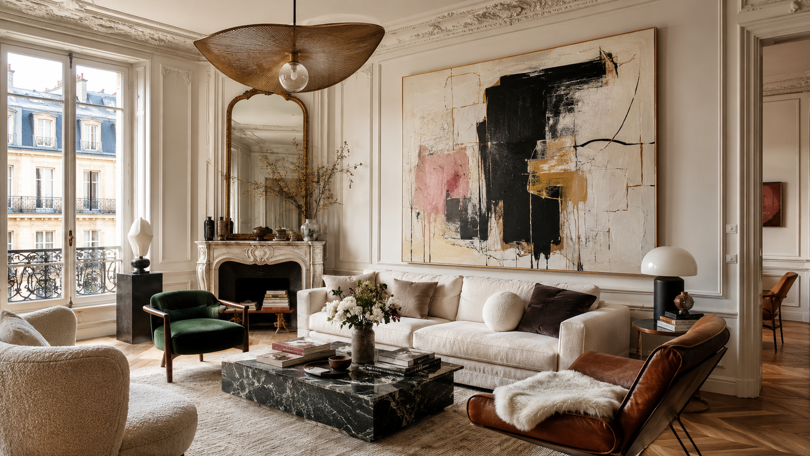
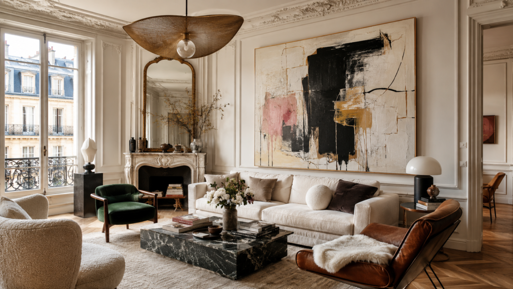
There is a moment, familiar to anyone who has ever stood in a freshly painted room, when the space feels finished and unfinished at the same time. The furniture is in place. The lighting works. The rug is exactly where the rug should be. And yet the room refuses to speak. It sits there, polite and mute, like a guest waiting to be introduced.
Nine times out of ten, the problem is the walls. Not the color of them — the scale of what’s on them.
Small art scattered across a large wall is one of the most common decorating instincts, and one of the most quietly self-defeating. A 12×16 print floating alone above a sofa doesn’t decorate the wall so much as apologize for it. The eye registers the mismatch instantly, even if the brain can’t name it. Interior designers have a phrase for this — “postage stamp syndrome” — and once you’ve heard it, you start seeing it everywhere: in rental apartments, in doctors’ waiting rooms, in otherwise beautiful homes where everything is right except the one thing that’s supposed to carry the room.
Large wall art solves this not by being louder, but by being honest about the space it occupies.
The Psychology of Scale
Humans respond to scale in ways that predate anything we’d call taste. Cathedral ceilings hush people. Murals stop foot traffic. The Rothko Chapel in Houston works precisely because the canvases are big enough that you can’t take them in with a glance — you have to stand inside their presence. Rothko himself insisted his large paintings be hung low and viewed close, so the viewer would be enveloped rather than merely shown something. “I paint big to be intimate,” he famously argued — a paradox that makes perfect sense the moment you’ve stood in front of one.
The same principle operates at domestic scale, just quieter. A single oversized piece — say, a 48×72 canvas on the main wall of a living room — does something a cluster of small frames rarely manages: it establishes a point of gravity. The room now has a center. Everything else, from the throw pillows to the bookshelf styling, becomes supporting cast rather than a crowd of competing extras.
This is why designers so often begin a room with the art rather than ending with it. A large piece dictates palette, mood, and even furniture placement. Working backward from a commanding artwork is far easier than trying to find something that matches a fully decided room — a lesson most of us learn the expensive way.
Scale Is Not the Same as Loudness
The most persistent misconception about large wall art is that “big” means “bold” — that scaling up requires a shrieking abstract in traffic-cone orange. It doesn’t. Some of the most effective oversized pieces are the quietest ones: a muted texture study, a fog-softened landscape, a monochrome photograph blown up until its grain becomes topography.
In fact, subtle imagery often benefits more from scale than dramatic imagery does. A small photo of morning mist over a lake is a pleasant thumbnail. The same image at five feet wide becomes atmospheric — it changes the perceived temperature of the room. Texture-driven art works the same way: what reads as flat pattern at 16 inches becomes almost sculptural at 60, catching light differently across the day.
The rule of thumb worth remembering: the larger the piece, the more restraint the imagery can afford. A giant canvas has presence built in. It doesn’t need to shout to be heard; it’s already the tallest person in the room.
Getting the Proportions Right
There’s a widely used formula in the design world, and it’s worth committing to memory because it prevents the vast majority of hanging mistakes: art above furniture should span roughly two-thirds to three-quarters of the furniture’s width. Above an 84-inch sofa, that means a piece (or a tight composition of pieces) somewhere between 56 and 63 inches wide. Anything much smaller starts to float; anything much wider starts to loom.
For a standalone wall — an entryway, a stair landing, the dead wall at the end of a hallway — aim to fill 60 to 75 percent of the available wall width. And on hanging height, the museum standard remains the most reliable guide: the center of the artwork should sit at about 57 inches from the floor, which corresponds to average eye level. People hang art too high far more often than too low, usually out of an instinct to “make room” beneath it. Resist that instinct. Art hung at eye level feels intentional; art hung near the ceiling feels like it’s trying to escape.
A few room-by-room notes worth folding into the plan. In living rooms, one dominant piece almost always outperforms a gallery wall when the goal is calm sophistication — gallery walls are wonderful, but they’re a different genre, closer to collage than statement. In bedrooms, the wall above the headboard is prime territory, and horizontal formats echo the geometry of the bed itself. In dining rooms, where people sit for extended periods facing the walls, large art earns its keep more than anywhere else in the house — it’s the closest thing a home has to a stage backdrop. And in offices, increasingly the most-photographed room in the house thanks to video calls, a large piece behind the desk does double duty as décor and as a considered public face.
The Practical Renaissance of Big Art
For most of modern history, genuinely large art was the province of people with art advisors and freight elevators. Original oversized canvases carried gallery prices; even large-format printing and framing could run into four figures once you factored in stretching, mounting, and shipping something the size of a door.
That economics has shifted dramatically, and it’s one of the more underappreciated stories in home design over the past decade. Print-on-demand production, giclée printing that rivals traditional photographic processes, and lighter framing systems have collapsed the cost of scale. What was once a five-thousand-dollar proposition can now be a few hundred, without the corresponding collapse in quality that usually accompanies that kind of price drop.
Some of the newer players in this space have pushed the format in genuinely clever directions. Wallpoppe’s large wall art collection, for instance, offers museum-quality prints at sizes running all the way up to eight feet tall — mural territory — with swappable designs, meaning the frame stays on the wall while the art itself can change with the seasons, or with your mood, or with the slow evolution of your taste. That swappability quietly resolves one of the oldest anxieties about buying big: the fear of committing. When the artwork can be exchanged without re-hanging hardware or patching drywall, an eight-foot canvas stops feeling like a marriage and starts feeling like a very good long-term relationship with an exit clause. They’ll also print your own image at those scales, which opens a door that used to be firmly shut — a photograph from your own life, rendered at a size that used to be reserved for museum retrospectives.

The result of all this is that scale, once the most exclusive dimension of art ownership, has become one of the most accessible. The limiting factor is no longer budget. It’s nerve.
The Case for Nerve
And nerve, honestly, is the real subject here. Most people under-scale their art not because they can’t afford larger pieces but because big art feels like a declaration, and declarations feel risky. A small print can hide. A six-foot canvas cannot. It says: I chose this. I meant it.
But that exposure is precisely what makes large art work. Rooms decorated entirely in safe, small gestures tend to feel like rooms decorated by committee — pleasant, forgettable, interchangeable with a thousand others. The rooms people remember, the ones that show up in the design magazines and get screenshotted from real estate listings, almost always contain at least one act of scale: the oversized landscape, the wall-dominating abstract, the photograph big enough to fall into.
There’s also a durability to the choice that smaller purchases lack. Trends in small décor churn constantly — the ceramic vases, the woven wall hangings, the neon signs, each arriving and departing on an eighteen-month cycle. A large, well-chosen artwork tends to outlast all of it, partly because scale itself never goes out of style, and partly because we choose big pieces more carefully than small ones. Nobody impulse-buys a seven-foot canvas. The deliberation is built into the format, and deliberation is where good taste actually lives.
Filling the Silence
Go back to that finished-but-unfinished room from the beginning. What it’s missing isn’t more stuff. It’s a voice — something on the walls proportionate to the space, confident enough to anchor everything around it.
The fix is rarely complicated. Measure the wall. Apply the two-thirds rule. Choose something you’d want to look at for a decade, at a size that treats the wall as a canvas rather than a bulletin board. Hang it at eye level. Then step back and notice how the rest of the room, without moving an inch, suddenly seems to know what it’s doing.
Big walls have always been an invitation. For a long time, most of us couldn’t afford to answer it. Now the only thing standing between an ordinary room and a memorable one is the willingness to go large — and the good sense to know that the wall was never asking for less.