Holly Williams for Art-Sheep
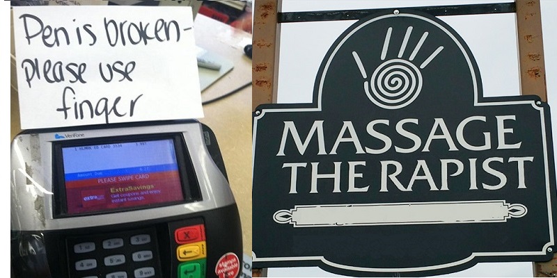
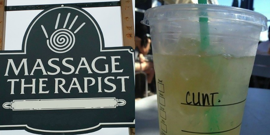
If grammar and spelling can, indeed, make a real difference sometimes, then the same can be said about letter spacing. Why? Well, you only have to check the following examples of truly unfortunate “kerning” ( aka the process of adjusting the spacing between characters), be it handwritten or on a sign, to see its hilarious effects for yourselves.
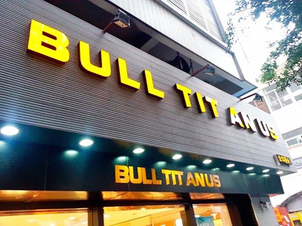
1. Imagine the look on this shopkeeper’s face when he realized that he had spent-what I presume was quite a considerable amount of money on this sign. Appearing twice.

2. Here, not only is the kerning quite unfortunate, but the “computer mouse” image on the left, really does nothing to help with the whole situation.
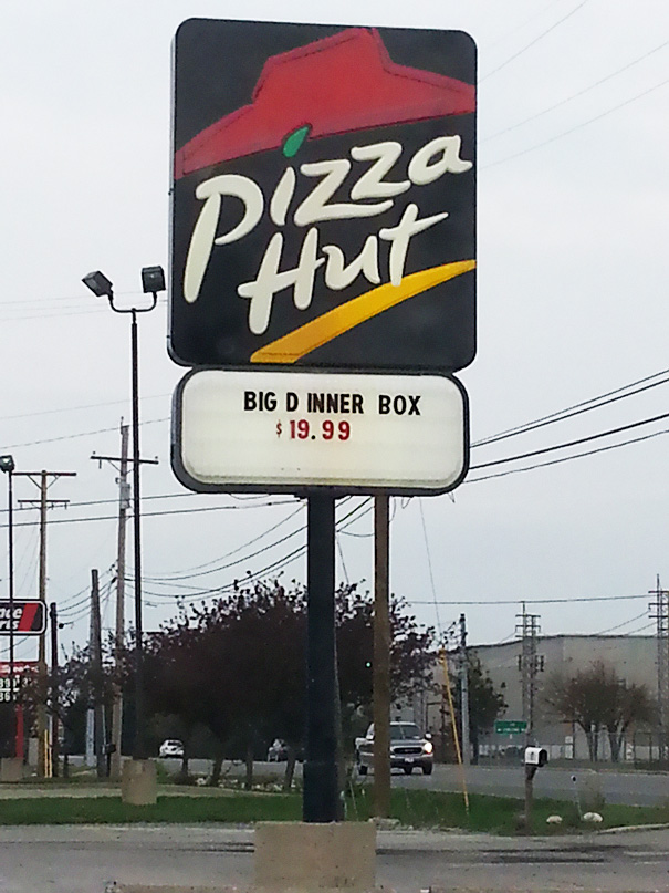
3. Order. If you dare.
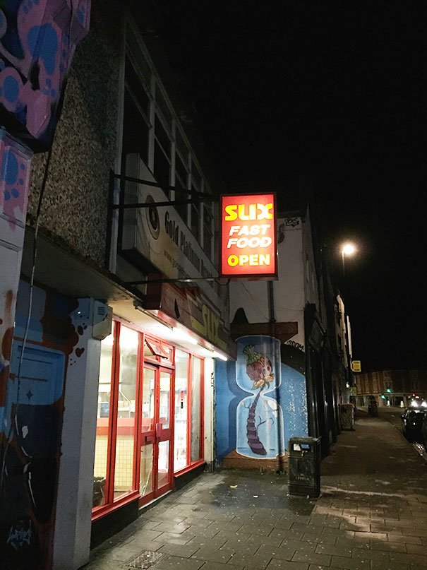
4. Not very helpful with the whole “marketing thing” there.

5. Clint, maybe the barista is trying to tell you something.
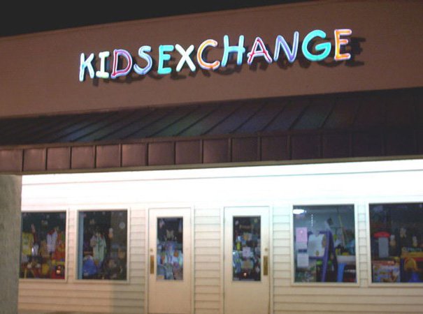
6. Someone, somewhere is deeply regretting this.
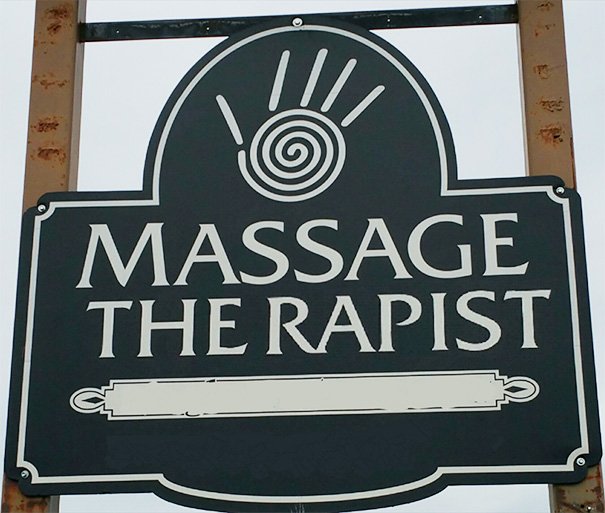
7. The what now?
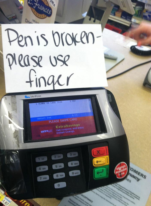
8. Probably the source of some serious misunderstandings.

9. I can see a pattern here…
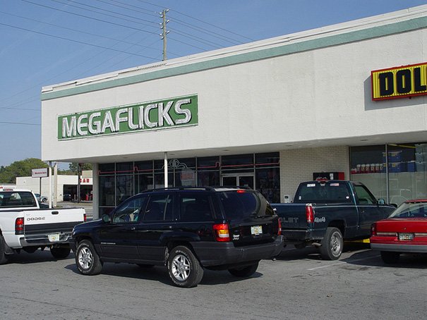
10. Apparently, none of them were given about the sign in question.

11. Someone, obviously, did not think this through.
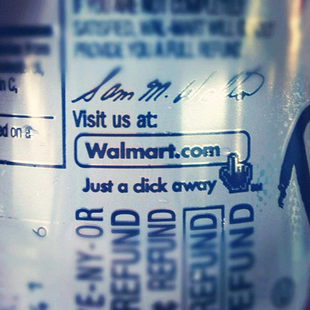
12. You lost us there, Walmart.

13. Not very appetizing.
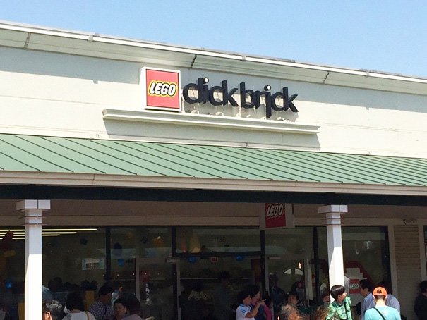
14. Oh, LEGO…
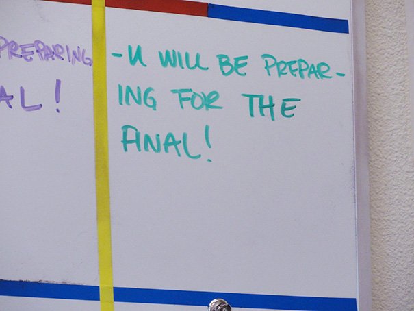
15. We all fervently hope the word here is “final”.
via boredpanda

