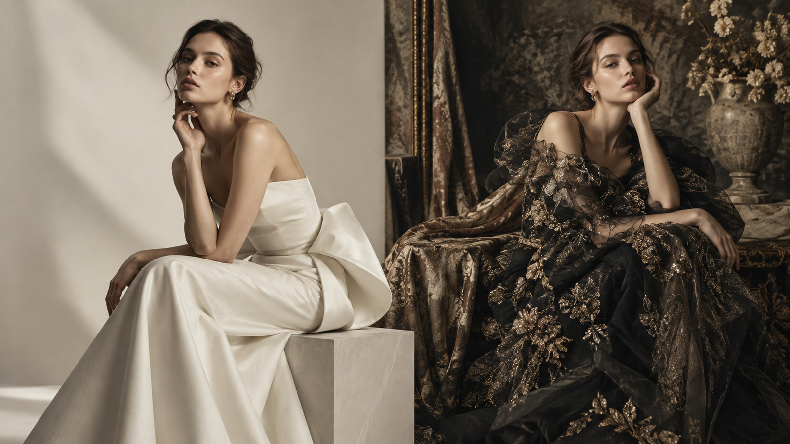
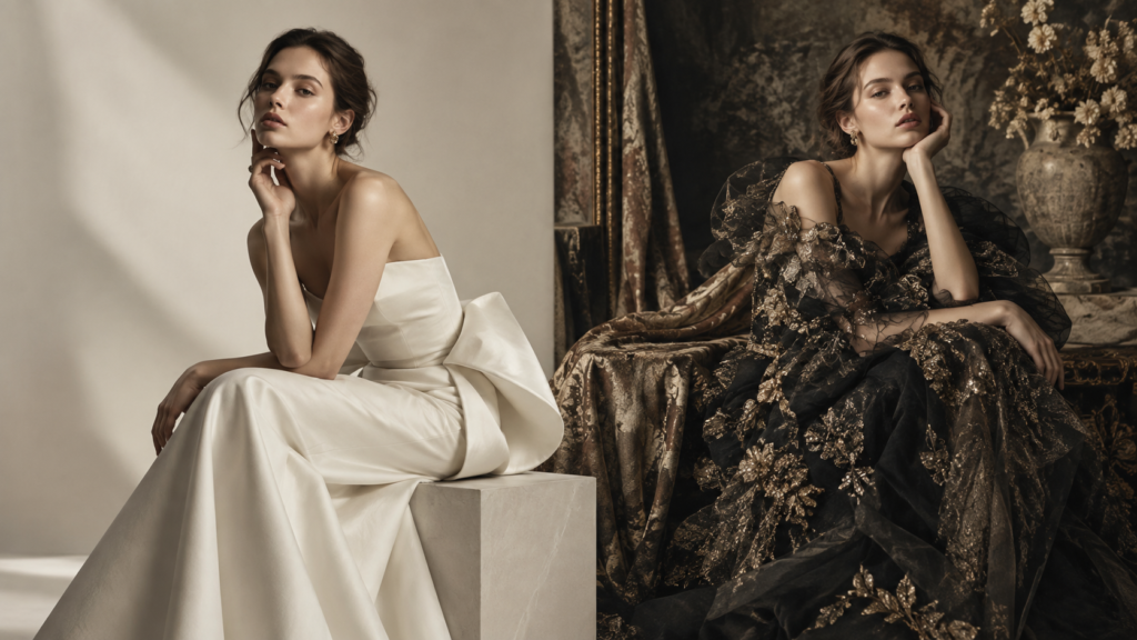
A portrait does not stop at the outline of the sitter. The space around the subject helps determine where the eye travels, how much visual tension the frame holds, and what kind of atmosphere the image creates.
Sometimes the background is meant to disappear. In other portraits, it provides texture, color, or movement that becomes part of the image’s visual language.
The most useful question, then, is not simply whether a background is attractive. It is what role the background should play in the portrait.
Minimal Backgrounds Keep Attention on the Subject
A minimal background reduces the number of visual elements competing for attention.
Solid colors, quiet neutrals, and restrained surfaces work particularly well when expression, styling, gesture, or lighting already carries most of the image.
Minimal does not necessarily mean empty.
A gradual shift in tone, a soft shadow, or a slight change in illumination can give the frame depth without introducing an obvious pattern or scene. These small variations can keep the image visually active while leaving the sitter as the strongest point of attention.
This kind of restraint can also create consistency across a portrait series. When the visual environment stays quiet, differences in expression, posture, clothing, and light become easier to notice.
Subtle Texture Adds Depth Without Taking Over the Frame
A clean portrait does not always need a perfectly flat background.
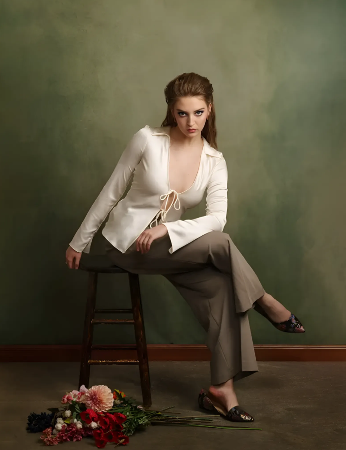
Painted surfaces, aged wall effects, mottled tones, and subtle texture can introduce enough variation to make the space behind the sitter feel more dimensional.
Scale is important here.
A texture that remains quiet around the edges of the frame can support the portrait without competing with it. Once the pattern becomes too dominant, however, the viewer may begin looking at the background and the sitter with equal attention.
Lighting changes this relationship again. Side light can reveal surface variation and tonal shifts, while broad frontal light may soften the same texture considerably.
Texture therefore functions less like decoration and more like another visual element that the photographer can reveal or suppress.
Painterly Backgrounds Bring a Different Kind of Space
Painterly backgrounds occupy an interesting position between a plain studio surface and a recognizable environment.
Softly blended tones, uneven color, and gradual transitions can create the suggestion of depth without identifying a specific room or location. The image retains the control of a studio portrait while avoiding the literal appearance of a blank wall.
That quality connects naturally with the visual language of traditional painted portraiture, where the space surrounding a figure often exists primarily to support the sitter rather than describe an exact setting.
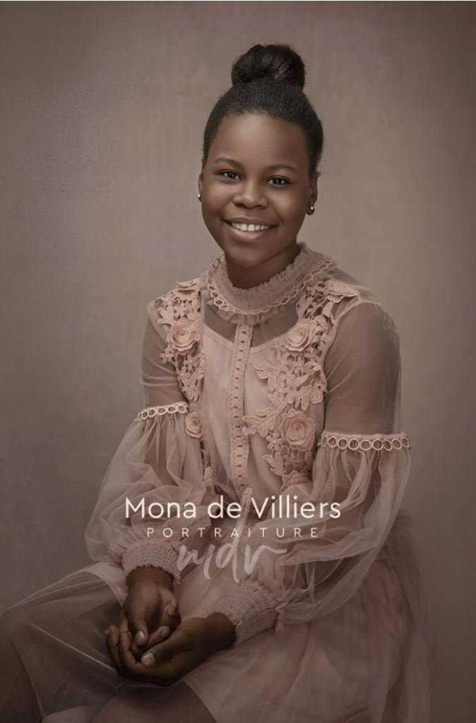
In photography, the effect can shift attention toward expression, pose, clothing, and light. The background still contributes atmosphere, but it does not need to tell a separate story of its own.
For portraits that lean toward classic, fine art inspired, or editorial styling, this balance can be particularly effective.
Abstract Backgrounds Introduce Movement and Mood
Abstract backgrounds allow the space behind the subject to become more active.
Irregular shapes, layered tones, expressive marks, and unexpected color transitions can create movement even when the sitter remains still.
Used carefully, abstract backdrops can contribute visual energy to a creative portrait and help establish a stronger sense of mood without introducing recognizable scenery.
The challenge is balance.
An abstract design can support an editorial concept when its shapes and colors reinforce the direction of the portrait. But if every part of the frame demands attention at once, the background can begin competing with the sitter.
This makes abstract portraiture less about choosing the most dramatic design and more about deciding how much visual activity the composition can carry.
Color Changes the Emotional Direction of a Portrait
Color influences how an image is read before the viewer consciously studies every detail.
Warmer tones may create a softer or more intimate atmosphere. Cooler colors can feel quieter, more restrained, or more distant. Muted palettes often remain secondary to the sitter, while highly saturated colors tend to take a more active role in the composition.
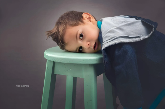
Wardrobe changes that relationship again.

A neutral outfit placed against a stronger background can make color feel like part of the art direction. Two similarly intense colors may create a deliberately energetic image. Closely related tones can produce something softer and more unified.
None of these approaches is automatically correct. Their value depends on what kind of emotional direction the portrait is trying to establish.
Background, Wardrobe and Lighting Should Work Together
A background is rarely successful in isolation.
Wardrobe, lighting direction, contrast, skin tone, pose, and framing all affect how the surrounding space is perceived.
When choosing photo backdrops for a studio portrait, it is more useful to think about how the background participates in the whole composition than to judge it as a separate visual object.
Lighting is particularly important because it can completely reinterpret the same surface.
A muted background may appear almost flat under soft frontal illumination and considerably more dramatic when directional light reveals its texture. A darker area may help separate a lighter garment, while a stronger patch of color can become a deliberate compositional counterpoint.
The background is therefore not simply selected before the portrait begins. Its visual role continues to change through lighting and framing.
Let the Background Support the Story
The strongest background choice usually begins with the idea behind the portrait.
If the image is built around expression, simplicity may be the most effective solution. If atmosphere matters, a textured or painterly surface may give the frame more depth. An editorial portrait may benefit from an abstract background that contributes movement or visual tension.
The background can disappear into the composition, quietly shape its atmosphere, or become an intentional part of the image.
What matters is knowing which of those roles it is supposed to play.
Conclusion
There is no single visual direction that suits every studio portrait.
Minimal surfaces create restraint. Texture introduces depth. Painterly backgrounds suggest atmosphere without defining a literal location. Abstract forms allow color and movement to participate more actively in the frame.
The choice becomes more convincing when it begins with intention rather than style alone.
When background, wardrobe, lighting, and composition are treated as parts of the same visual system, the space behind the sitter stops being an afterthought. It becomes part of how the portrait communicates.