Your design team has 48 hours until launch. The client just killed your custom illustrations. “Too corporate,” they say. You open another stock site. Everything looks like it was drawn in 2011. Welcome to every designer’s recurring nightmare.
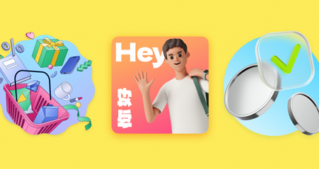
Icons8 built Ouch to fix this specific hell. Started with 300 illustrations in 2022. Now thousands across 21 styles. But the number doesn’t matter. What matters: they built illustrations you can actually tear apart and rebuild.
Why Modular Construction Actually Matters
Picture this. You find an illustration that’s almost perfect. Wrong color shirt. Character facing the wrong way. Background doesn’t match your brand. On normal stock sites, you’re screwed. Start searching again.
Ouch breaks everything into pieces. Characters exist separately from backgrounds. Objects float independently. Effects layer individually. Grab what works. Delete what doesn’t. Change anything else. The files don’t fall apart when you edit them because they’re built for modification from day one.
I watched this save a product launch last December. Meditation app. Ten days to ship. Original illustrations looked too medical. Designer grabbed Ouch’s Flame style, pulled the characters, swapped backgrounds, adjusted the color palette to match their purple gradient thing. Two hours of work instead of two weeks of revision cycles. Users specifically mentioned feeling “welcomed” by the visuals. That’s not decoration. That’s functional communication working.
Technical Implementation That Respects Developer Sanity
Developers know this pain. Mockup shows beautiful illustrations. You search for those exact assets. They don’t exist. You find something similar. It’s a 4MB PNG. Your lighthouse score commits suicide. The designer asks why it looks different. You explain. Nobody listens. You implement it anyway. Performance tanks. Everyone blames you.
Ouch ships proper formats. SVG that actually scales. PNG with real transparency, not that white background pretending to be transparent. Lottie JSON for animations that don’t destroy mobile performance. GIF because sometimes you need to post on LinkedIn. MOV for that sales deck. After Effects projects when motion designers get involved.
File sizes make sense. A complete animated scene under 100KB. SVG code that humans can read. Naming conventions that follow patterns. Your build process won’t break. Your CDN won’t cry. Your users won’t wait.
Marketing Velocity Without Designer Bottlenecks
Marketing needs images constantly. Blog headers. Social posts. Email campaigns. Landing pages. Slide decks. The traditional workflow: bug the designer, wait three days, get something that’s not quite right, bug them again, miss your publishing deadline.
Mega Creator kills this bottleneck. Browser based. No software licenses. Marketing managers edit directly. That spring campaign needs lighter colors? Change them. Regional audience prefers different imagery? Swap components. A/B testing different emotional tones? Create variants in minutes.
E-commerce teams discovered something valuable in their shopping clipart collections. Product categories need distinct visual identities. Sale banners require energy without chaos. Checkout flows demand trust signals. One visual system, infinite variations, zero designer time per iteration.
Email marketers finally got lightweight visuals. Heavy images trigger spam filters. Complex graphics break in Outlook. Ouch’s optimized exports work everywhere. Your newsletter reaches inboxes, not spam folders.
Solving the Empty State Problem
Empty states kill user engagement. New users open your app. Blank screen. They leave. You lose.
Text instructions don’t work. “Click here to add your first project” gets ignored. Add an illustration showing the action? Engagement jumps. Not because it’s pretty. Because humans process visual information 60,000 times faster than text. MIT studied this in 2014. Your brain gets it before you even think about it.
404 pages showcase this perfectly. Generic “Page not found” messages frustrate users. Add a confused character that matches your brand personality? Users smile. They click back to your homepage instead of closing the tab. Small detail. Huge impact on bounce rates.
The modular system means you’re not searching for the perfect “empty inbox” illustration. You build it. Take a character. Add an envelope. Adjust expressions. Match brand colors. Ship. Next problem.
Educational Content That Doesn’t Patronize
Teachers face an impossible challenge. Make complex topics engaging. Respect diverse learning styles. Stay within microscopic budgets. Don’t violate copyright. Most educational clipart looks like it escaped from Windows 95.
Ouch’s academic collections changed this game. Anatomy diagrams that won’t get your course pulled. Geography visuals without cultural stereotypes. Science illustrations that explain without oversimplifying. Mathematics concepts that actually help understanding.
Universities report measurable improvements. Arizona State’s online program saw 23% better retention in courses using consistent visual languages. Not because pictures are fun. Because visual consistency reduces cognitive load. Students spend energy learning concepts, not decoding random visual styles.
K-12 teachers modify illustrations for specific lessons. Teaching photosynthesis? Adjust the diagram to highlight today’s concept. Explaining democracy? Adapt the visuals for your country’s system. Same foundation, contextual modifications, zero illustration budget required.
Startups Looking Legitimate on Zero Budget
Your startup needs to not look like a startup. Investors judge your pitch deck in seconds. Users decide trust instantly. Professional visuals cost thousands. You have hundreds.
Free tier with attribution gets you started. Landing page looks professional. Pitch deck has consistent visuals. Remove attribution when revenue arrives. Modify components as your brand evolves. You’re building visual equity without upfront investment.
That mental health startup everyone’s quoting? Started with Ouch’s basic style. Post Series B, they evolved those base components into distinctive brand assets. Investors never knew. Users didn’t care. The visuals communicated professionalism from day one.
Developer Integration Beyond Token Gestures
Most illustration platforms treat developers as download monkeys. Here’s a zip file. Figure it out. Ouch built actual integration.
API access means dynamic illustration generation. User completes onboarding? Generate a celebration visual. Error occurs? Create contextual error imagery. Treat illustrations as content, not static decorations.

The desktop app drops directly into VS Code. Figma plugin maintains your design system. Sketch integration preserves your workflow. Build scripts can fetch assets programmatically. This isn’t groundbreaking technology. It’s just competent implementation, which feels revolutionary in this space.
Performance optimization happens automatically. No manual image compression. No SVG cleanup. No animation optimization. Files arrive ready for production. Your Core Web Vitals stay green.
Platform Evolution Based on Reality
Icons8 added AI generation that makes sense. Not random image generation. Style consistent variations. The AI understands visual systems. Generate alternatives that actually match your existing assets.
Recent updates show they’re listening. Better search that actually finds things. Collections organized by actual use cases, not arbitrary categories. Export options that match real workflows. They ship updates based on support tickets, not marketing theories.
The ecosystem integration matters. Icons, illustrations, photos, audio from one vendor. One contract negotiation. One invoice. One access portal. Enterprise procurement departments love this. So do small teams tired of juggling subscriptions.
Competition Misses the Point
Other platforms have more illustrations. Some have fancier effects. Many cost less. They’re solving the wrong problem.
Teams don’t need infinite choices. They need control over their choices. They need consistency across touchpoints. They need to ship without asking designers to redraw everything. Ouch provides control through modularity. Everything else is distraction.
The Honest Assessment
Ouch won’t replace custom illustration for luxury brands. Some industries need specialized imagery you won’t find here. The web editor requires internet. Obviously. Certain styles blur together if you’re not paying attention.
But for shipping products? For teams publishing weekly? For anyone who needs professional visuals without professional budgets? Ouch works.
Not because it’s revolutionary. Because it’s practical. Because someone finally asked how designers actually work instead of assuming. Because sometimes you need to modify an illustration at 2 AM before tomorrow’s presentation. Because perfect illustrations that arrive after launch are worthless.
The platform succeeds by acknowledging reality. Design teams need flexibility more than perfection. Speed matters more than infinite options. Integration beats isolated excellence. Ouch delivers these priorities through modular systems, comprehensive formats, and workflow respect.
Visual communication keeps growing more critical. Platforms that understand workflow reality survive. Those selling pretty pictures without modification capability won’t. Ouch picked the right side of that divide.