Keeping a steady look and feel across websites, apps, and social posts is hard work. Teams move fast, campaigns change, and not every shoot fits every need. Stock photos give you a flexible toolkit, so you can stay on brand without slowing down.
Used with a plan, they help you keep colors, moods, and subjects aligned. That makes every touchpoint feel familiar, which builds trust and saves time.
Why Visual Consistency Matters
A steady visual style helps people recognize you at a glance. It reduces friction, so your message does not fight your design. It also lets different teams ship content that feels like it came from one place.
The business case is strong, too. A business publication noted that the stock images market is set to rise from about $6.4 billion in 2022 to roughly $12.2 billion by 2032, which shows how central stock visuals have become to modern content workflows.
What Makes Visual Consistency Work
Stock photos shine when you define what “on brand” looks like. Create clear rules for color, light, subjects, and framing, and your choices become faster and safer. Your team can move from guesswork to confident picks.
Set a simple test for every image – does it match your brand’s emotion, and does it hold up next to the last 5 posts. If you need practical next steps, you can also learn about AI stock photos to see how new tools expand your options without breaking your style. Keep this check lightweight, and repeat it across channels and regions.
Building A Reusable Stock Photo System
Build a shared library that maps to your core stories. Organize albums by use case, like hero banners, product explainers, testimonials, and seasonal moments. Tag each image with format, mood, and safe crops.
- Define 8 to 12 core use cases that repeat across the year
- For each use case, save 10 to 20 preapproved images and alternates
- Tag by color family, lighting, negative space, and focal distance
- Add example placements for web, email, and social sizes
- Keep a short list of “never use” images for common pitfalls
Template Types
Create a few layout templates that your stock photos can slot into with minimal edits. For example, hero banners with left-side copy space, or square posts with center focus. Templates reduce the risk of random crops and mismatched type.
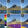
Color, Light, And Composition Guidelines
Color is the fastest path to recognition. Choose a primary palette and a small set of neutrals, then favor stock photos that echo those tones. If your brand leans cool, skip warm yellow scenes unless the story calls for contrast.
Light and composition matter just as much. Prefer consistent lighting styles like soft daylight or clean studio light. Stick to similar angles and depth of field to avoid a patchwork look across your grid.
Matching People And Context Across Channels
Faces, roles, and settings send strong signals about who your brand is for. Pick stock photos that reflect your real audience in terms of age, culture, and ability. Keep wardrobe and environments consistent with your product and price point.
Repeat visual motifs across channels. If your web pages use close-up hands and tools, do the same in email and social. Align background textures and props too, so nothing feels out of place next to your typography and icons.
Balancing AI And Traditional Stock
AI imagery can fill gaps when you need a niche scene, a hard-to-shoot angle, or perfect negative space. Traditional stock is great when you want lived-in realism and complex human details. Use both, and let your style guide decide which to pull first.
Keep the output consistent by locking in prompts or shot lists that mirror your brand rules. Save side-by-side examples that show approved looks next to rejected ones. That way, your team knows when an image feels too glossy, too busy, or off-tone.
Governance, Rights, And File Hygiene
Even with stock photos, governance protects you from surprises. Track license scopes and expirations, especially on model or property release terms. Favor sources that make rights simple to audit and renew.
- Store originals and edited versions in a single folder per asset
- Rename files with use case, channel, and size codes
- Keep layered edits so you can re-crop without quality loss
- Record license type, renewal date, and any usage limits
- Archive retired images to prevent accidental reuse

Workflow Guardrails
Bake checks into your publishing steps. Before posting, confirm crop safety, text legibility, and alt text. For paid media, double-check that usage rights match geography and duration.
Measuring Impact And Iterating
Consistent visuals should earn their keep. Track engagement and conversion across pages that use your stock photo system vs. ad hoc picks. Look for gains in time on page, click-through, and task completion.
There is also a link between consistency and growth. One retail research group reported that most organizations credit brand consistency with adding at least 10 percent to revenue growth, which supports investing in repeatable visuals. Review results monthly, retire weak images, and add fresh options that still match your rules.
Bringing It All Together Across Formats
Treat every format as part of one gallery. Hero images, email headers, carousel frames, and blog thumbnails should share colors, lighting, and pacing. Your audience should feel the same brand cue whether they see a billboard, a reel, or a help article.
When you do need variety, change one variable at a time. Keep color and light the same, but shift the subject or angle. Or hold the subject steady and swap backgrounds with matching tones. This keeps freshness without breaking the thread.
Scale Without Losing The Thread
As teams grow, your system should simplify decisions, not add steps. Use a short checklist inside your design tool that flags color clashes and off-brand crops. Save starter collections for new hires, so they can ship day one.
Rotate in seasonal sets that still obey your core rules. Keep 70 percent evergreen images and 30 percent timely scenes. This balance helps your library feel alive while staying unmistakably yours.
A stock photo strategy is not about sameness. It is about coherence that lets your message do the heavy lifting. With clear rules, a shared library, and steady governance, your visuals will work together at any speed or scale.