Some things don’t need to make a big deal out of themselves. They are there, but you don’t notice them right away. You notice them through the way they fit, the material, and how they move against your body on a gray morning. For more than 160 years, Burberry has been making things in that style, creating one of the most consistent visual languages in modern fashion. Not by constantly coming up with new ideas, but by sticking to a set of ideas.
When Clothing Becomes Visual Language
At its most basic, fashion is never just clothes. It works more like architecture or typography, which are planned choices about shape, material, and proportion that convey meaning beyond just how it works. The weight of a fabric, the geometry of a pattern, the way a collar is cut: these are visual choices as intentional as any made by a photographer or a designer working in another medium. The most enduring fashion houses understand this distinction. Burberry has built its entire identity around it.
Most brands operate within a cycle of desire and obsolescence — producing work that feels urgent one season and irrelevant the next. Burberry has largely resisted this rhythm. The brand returns consistently to the same core principles: practicality, restraint, and the particular value of something made to last. The result is a visual identity that feels neither nostalgic nor anxious — one that doesn’t need to prove anything, because it already knows what it is.
A Fabric That Changed Everything
When Thomas Burberry developed gabardine in 1879, the goal was straightforward: solve the problem of outerwear that was either waterproof and unbearable or breathable and useless in rain. Gabardine — a tightly woven fabric waterproofed at the yarn stage rather than the surface — resolved both issues at once. It was lightweight, durable, and genuinely suited to the British climate.
What wasn’t immediately obvious was the aesthetic consequence of that invention. Without the bulk of older waterproofing methods, tailoring could become sharper — cleaner lines, slimmer silhouettes, a drape that moved with the body. The practical problem and the visual one had the same answer. From the very beginning, function and aesthetics at Burberry were not competing priorities. They were the same priority, approached from different directions — and that alignment has remained the foundation of the brand’s design logic ever since.
The Trench Coat as a Piece of Art
The trench coat was not designed to be beautiful. It emerged from Burberry’s work supplying the British military during both World Wars — belted waist, storm flap, deep lapels, structured shoulder — each feature a direct response to field conditions: cold, rain, mud, the need for mobility. Nothing in the original design was decorative.
But the shape that those limits create is one of the most timelessly elegant shapes in Western clothing. After 1945, it went back to civilian life with a lot of meaning. It showed up in movies and on artists and public figures who knew right away that it meant more than just what it did. Seriousness. Calmness. A specific type of self-control. That resonance was never planned. It took decades to build up, just like all real cultural meaning does.
What successive creative directors have managed is to keep the coat alive without freezing it. Proportions are adjusted, materials updated, details reworked — but the essential grammar remains. A Burberry trench from twenty years ago and one from the current season are immediately legible as the same object. That continuity, sustained across multiple creative transitions, is a significant design achievement.
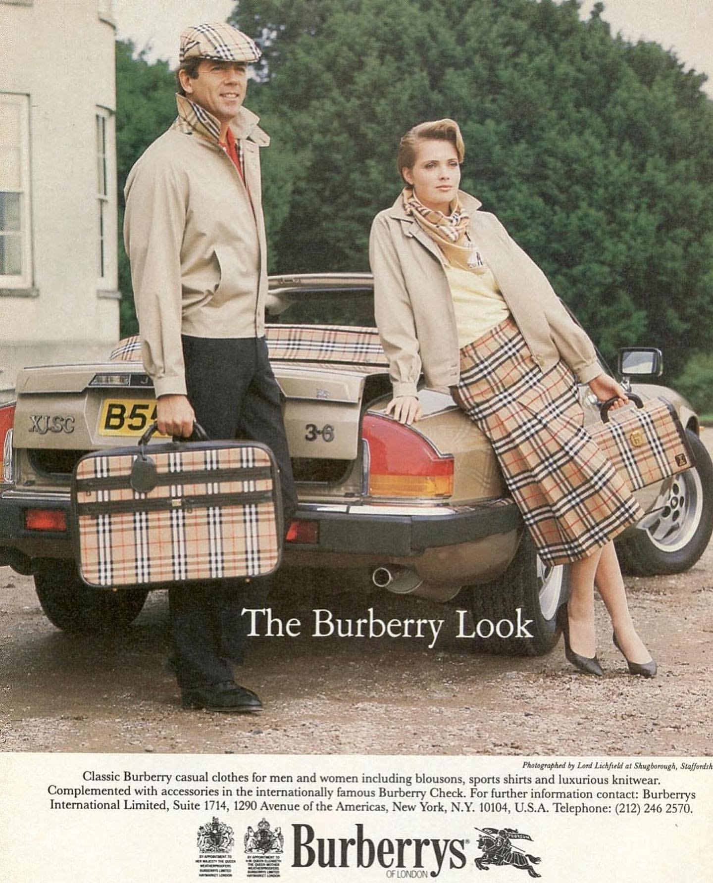
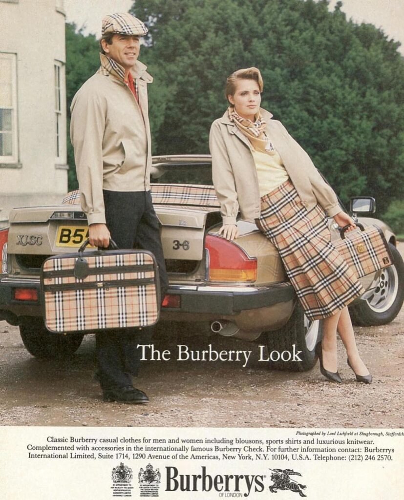
The Check — A Pattern With a Life of Its Own
The Burberry check — camel, black, red, and white — originated as a lining. It was not intended to be visible. As it gradually appeared on scarves and accessories, it became one of the most recognized patterns in fashion: a piece of visual shorthand for a particular standard of British quality, legible across cultures and immediately associated with the brand.
By the 1990s and early 2000s, that recognition had become a problem. The check was among the most counterfeited patterns in the industry — overexposed, diluted, and carrying associations the brand had not chosen. Rather than rebranding or amplifying its presence, Burberry pulled back. The pattern retreated into linings, into small details, into things only visible on close inspection. It was a lesson in how a visual language is maintained — not by defending it loudly, but by deploying it with greater care.
Reintroduced gradually, the check recovered its original function. Today it appears not as a dominant message but as a considered detail — something that rewards attention rather than demanding it. The shift from logo to signature is a meaningful one, and it was achieved through restraint rather than redesign.
Accessories as Extensions of a Visual Philosophy
For most people, a Burberry trench coat is an occasional purchase. Accessories are how the brand maintains a presence in everyday life — and they operate according to the same design principles at a reduced scale.
The Burberry scarf is perhaps the clearest example: a design that makes no attempt to be interesting on its own terms, relying entirely on the quality of the cashmere, the precision of the weave, and the proportions of the check. Nothing added, nothing unnecessary. The Thomas Bag applies the house check as a structural element — woven into the canvas of the object rather than applied to its surface. Burberry sunglasses follow the same restrained logic: architectural frames designed to complement the clothes rather than compete with them. Leather goods carry the check as a lining detail or a quiet embossed mark — present, but not emphatic.

The consistency across these objects is not accidental. At every scale, the visual grammar holds. Footwear has become an increasingly central part of this system in recent seasons — Derby shoes, Chelsea boots, reinterpreted sneakers — demonstrating that the brand’s design language is flexible enough to move across categories without losing coherence. Through accessories, Burberry becomes part of how people dress daily, not only how they dress for occasions.
Photography and Visual Storytelling
Fashion is not only worn — it is seen. Burberry has consistently understood that the images surrounding its collections are as significant as the collections themselves. Campaign photography, editorial work, and the brand’s broader visual presence are not separate from the design process. They are extensions of it — part of the same visual statement, shaped by the same underlying principles.
Burberry’s visual world returns repeatedly to a particular atmosphere: overcast skies, wet stone, the grey diffuse light of the English countryside. The choice is not incidental. These are the conditions the clothes were designed for, and presenting them in that context reinforces something essential about the design logic — that a garment built for actual weather is more elegant for it, not less. At their best, the campaigns function as visual art: images with a coherent point of view, a considered relationship between subject, light, and setting, that ask to be looked at rather than merely consumed.
Restraint as a Creative Statement
In a landscape that consistently rewards novelty, Burberry’s commitment to a stable visual philosophy represents a quietly radical position. The brand does not reinvent itself to signal currency. It does not abandon its archive in pursuit of new audiences. It does not chase collaborations for visibility, redesign its identity on a cycle, or expand into categories unrelated to its core.
Each of these is a choice — and each reflects an understanding that short-term attention and long-term value are not the same thing. What Burberry does instead is return, season after season, to the same foundational ideas — practicality, restraint, the enduring value of something made to last — and find ways to make them feel present. That is a different kind of creative discipline: less visible, perhaps, but considerably more durable. And durability, in the end, is exactly what Burberry has always been about.