
Alt: Museum map display on a beige wall.
The three most effective tricks for seamless tablet kiosk design include matching hardware finishes to the surrounding architecture, utilizing zero-clearance wall mounts, and implementing hidden Power over Ethernet infrastructure to elevate public space innovation.
By treating interactive touchpoints as integral architectural elements rather than bolted-on IT fixtures, designers can dramatically improve both aesthetics and user engagement.
These simple spatial strategies transform otherwise bulky digital displays into natural, integrated components of museums, retail showrooms, and hotel lobbies.
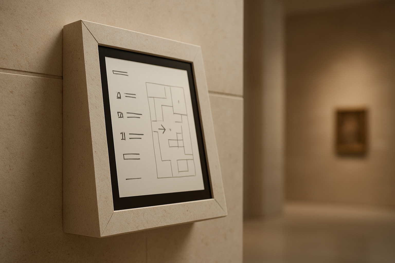
Stepping into a contemporary museum lobby often reveals how this works in practice. A digital kiosk guides visitors through the day’s exhibitions, sitting flush against the wall, its aluminum edge catching the same cool light as the gallery panels beside it.
No cables are snaking to a power strip, no bulky housing interrupting the sightline, and no branded plastic shell announcing itself as technology.
That kind of seamless integration is no longer the exclusive domain of flagship cultural institutions with seven-figure fit-out budgets. It is increasingly the expectation wherever spatial design is treated with intention rather than as an IT procurement exercise.
The gap between that expectation and reality remains wide, but closing it does not require a complete redesign of the budget if the right principles are applied early.
Integrated Technology as a Design Language
Before applying specific spatial tricks, it is worth understanding why this visual gap exists at all and why it has started to close across the design sector.
The first generation of public-facing kiosks was utilitarian by design philosophy. Early ATMs, ticketing terminals, and information points were conceived as functional objects, visually isolated from their environments to signal availability rather than integration.
The hardware communicated a purely mechanical purpose, which worked when interactive technology was novel enough to justify the aesthetic interruption.
Today, research from the digital signage industry consistently shows that contextually integrated displays outperform visually disruptive ones on engagement metrics.
A recent report noted that harmonized in-environment displays generate measurably higher dwell times and interaction rates than standalone units.
The vocabulary of that language includes material finish, mounting profile, cable visibility, and compliance with human ergonomic standards. Understanding these elements makes the following spatial strategies feel purposeful rather than arbitrary. They are core design principles with measurable consequences for both user engagement and spatial harmony.
| Key Insight: Harmonized in-environment displays generate measurably higher dwell times and interaction rates than standalone units. Contextually integrated technology doesn’t just look better, it actively drives user engagement. |
3 Easy Tricks for Better Tablet Kiosk Design
1. Choose Hardware That Disappears Into the Space
The single most common visual mistake in kiosk deployment is hardware that actively fights its surrounding environment.
Bulky frames in mismatched finishes, visible mounting brackets, and cable bundles gathered at the base of a stand all signal an afterthought. These distracting elements undermine the spatial design investment of the room around them.
The fix begins at the specification stage by matching enclosure material and finish to the surrounding architecture.
Specifying brushed aluminum in contemporary lobbies or powder-coated matte black in gallery environments determines whether the hardware reads as designed or merely deployed. Most importantly, the mounting profile dictates spatial harmony and continuous visual flow.
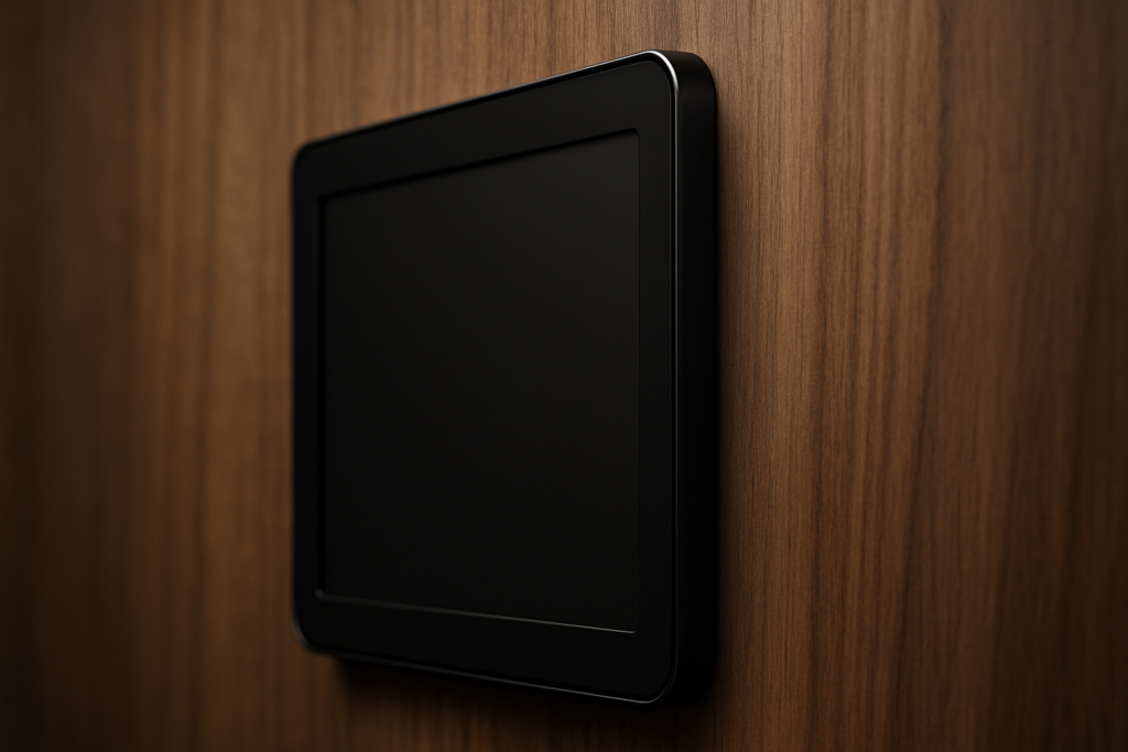
A tablet enclosure that projects several inches from the wall creates a visual ledge that catches shadows and interrupts sightlines. A zero-clearance mount reads instead as a designed, intentional architectural element. This principle is highly visible in purpose-built enclosures from manufacturers that take zero-clearance engineering seriously.
Brands with premium lines often incorporate hidden wiring systems and ultra-slim wall profiles so the hardware completely recedes from view. For example, utilizing VidaBox’s premium POS tablet stand or similar zero-clearance enclosures ensures only the active screen remains visible.
For multi-site rollouts, broad device compatibility across major tablet manufacturers also ensures future device transitions will not require full enclosure replacements.
2. Design for the Human Body First
Reframing ADA compliance as a foundational design constraint rather than a regulatory checkbox is an incredibly useful mindset shift.
Accessible architecture has demonstrated for decades that environments designed for universal access produce the most spatially generous experiences. The ADA Standards for Accessible Design provide excellent baseline metrics for truly ergonomic kiosk installations.
For instance, regulations dictate that the display screen shall be visible from a point located 40 inches above the center of the clear floor space in front of the machine.
Additionally, standard guidelines note that characters displayed on the screen shall be in a sans-serif font and a minimum of 3/16 inch high. They must also contrast with their background, ensuring legibility for all visual abilities.
Physical interactive elements are equally governed by these universal design principles. If physical buttons are used, function key surfaces shall have tactile symbols, such as a raised circle for an Enter key or a raised plus sign for an Add Value key. Following these guidelines consistently produces installations that feel intuitive to virtually every single user.
In a recent retail example, a loyalty kiosk redesigned to meet ADA height requirements unexpectedly became the highest-traffic station on the floor.
The lower, slightly angled screen felt approachable rather than authoritative, allowing interaction without requiring users to break their stride. Standardized VESA-compatible mounting interfaces support this principle across diverse project portfolios by allowing precise adjustments.
| Warning/Important: Treating cable management as a post-installation afterthought inevitably ruins the visual harmony of your space. Always specify conduit runs and Power over Ethernet (PoE) during the architectural planning stage. |
Innovative Materials and Techniques


The material palette available to designers specifying public-space hardware has expanded considerably in recent years.
The gap between commodity brackets and precision-engineered enclosures is now wide enough to produce meaningfully different aesthetic outcomes. CNC-milled aluminum, for instance, offers exceptional surface quality and dimensional accuracy.
Precision machining produces enclosures that fit specific tablet dimensions exactly, rather than approximating them with adjustable plastic clips.
An enclosure specified to the exact device footprint reads as intentional, whereas an off-the-shelf bracket with visible gaps reads as improvised. Powder-coated steel and sustainable composites extend this material conversation to overall installation durability.
The role of 3D printing also deserves specific attention for designers working with complex spatial constraints. OpenVESA-compatible printed components enable rapid prototyping and low-minimum custom production runs for unusual architectural setups.
This allows designers to iterate on mounting geometries without committing to expensive, large-volume manufacturing.
Furthermore, tamper-proof security serves as a vital design virtue rather than just a technical specification. Hardware engineered to resist physical tampering also prevents the visual entropy that ages public installations prematurely. An enclosure that maintains its physical integrity over years of interaction perfectly preserves its original design intent.
| Key Insight: Tamper-proof security isn’t just about protecting hardware; it is a crucial design virtue. Equipment engineered to resist physical tampering ultimately prevents the visual entropy that ages public installations prematurely. |
The Road Forward
Returning to that flawlessly executed museum lobby, the kiosk that reads as a harmonious architectural element is the product of deliberate choices.
A hardware profile sitting flush against the wall, an intuitive mounting height, and an invisible power run all contribute to this success. In modern public spaces, spatial design ultimately dictates the overall user experience.
Every element of a kiosk installation either contributes to that spatial harmony or distracts from it. The displays that engage audiences most effectively make the technology feel inevitable in the space rather than imposed upon it.
As interactive interfaces replace traditional signage, treating hardware selection as a core design discipline is essential.
Consistently applying these principles will produce installations that age gracefully and engage audiences naturally.
Exploring purpose-built, architecturally minded solutions is the most practical starting point for closing the gap between design intent and deployed reality. Prioritizing these spatial tricks at the specification stage ensures lasting aesthetic integrity for any project.
| Author Profile: VidaBox is the leading manufacturer of tablet enclosures and mounting solutions for businesses worldwide. |