The first question most interior designers ask when a client proposes neon is simple: Does the room earn it? Not whether the sign is trendy, but whether the space has the right wall depth, contrast, and lighting layers to carry it well. When those pieces are in place, neon stops feeling like a gimmick and becomes part of the architecture.
Instead of buying whatever sign happens to look decent online, more homeowners are choosing custom neon signs that fit a room’s proportions, palette, and mood. And frankly, that’s the difference between a room that feels designed and one that feels like it lost an argument with Instagram.
What follows are ten ways to use neon signs in home interior design without making your house look like a cocktail bar that forgot to close.
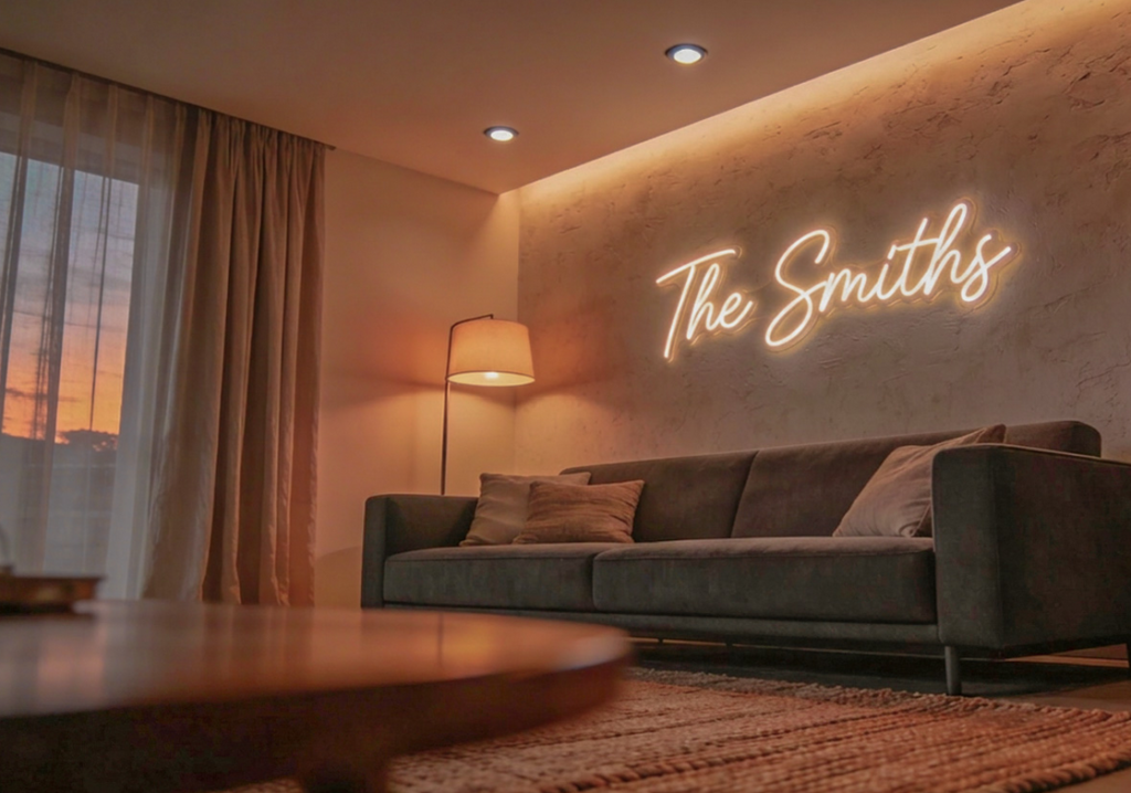
1. The wall behind the sofa should do more
The wall behind the sofa is usually the room’s biggest visual opportunity. Too often, it gets wasted on a forgettable print. A well-scaled neon sign can turn that wall into a proper focal point, especially when it aligns with the sofa’s width or echoes the lines of paneling, shelving, or nearby artwork. The trick isn’t to make it louder than everything else. It’s to make it more memorable.
In modern living rooms, softer tones tend to win. Warm white, blush, or muted amber sit better with textured fabrics and wood finishes than hyper-saturated color does.
If ceiling spots and floor lamps are already working hard, keep the neon on a dimmer so it glows rather than shouts; no room has ever looked more elegant because one feature was trying too hard.
LED neon flex runs at a lower voltage, stays cooler, and holds up better over time than traditional glass neon, making it far more practical for everyday residential use.
2. Bedroom neon sign works best when it calms down
A bedroom doesn’t need more stimulation. It needs an atmosphere. That’s why a neon sign works best here when it acts as soft accent lighting rather than a glowing headline demanding attention above the bed.
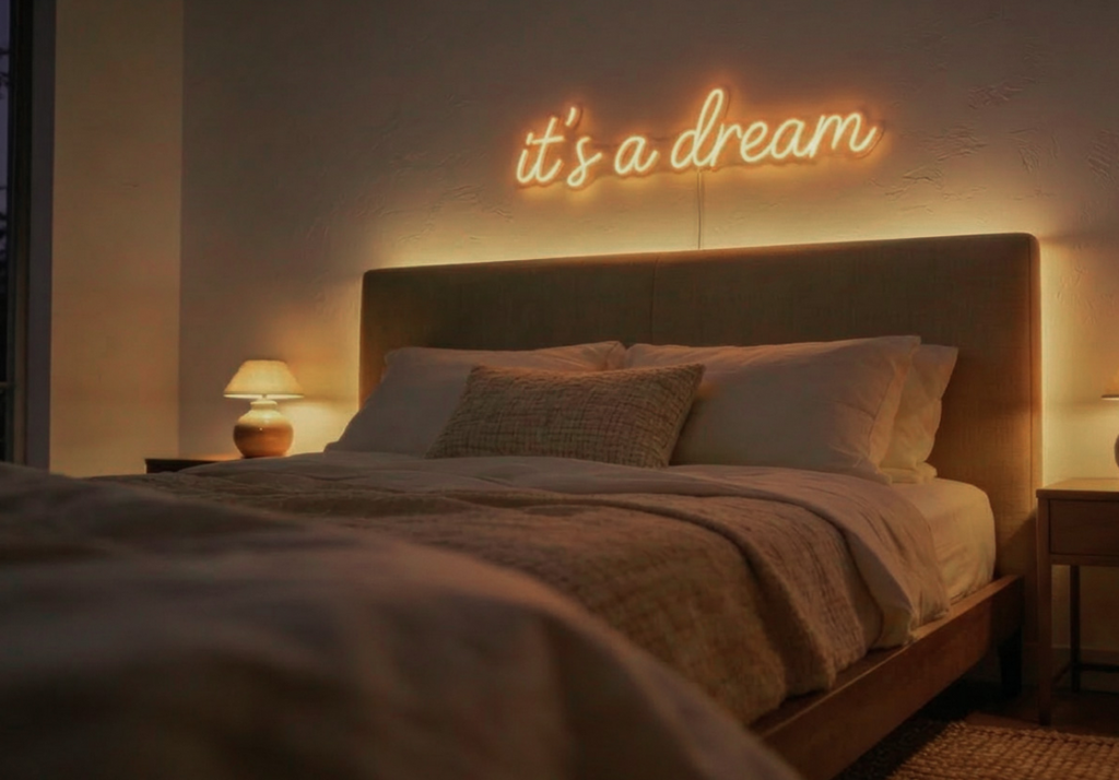
Placed above a headboard or slightly offset to one side, a simple script or minimal line drawing can replace generic wall art and give the room a quieter identity.
Warm white and soft amber are usually the smartest choices; spaces built around upholstered beds, layered linens, and muted finishes tend to absorb cooler or brighter hues badly. Cooler tones can work in teen rooms or bolder schemes, but in most adult bedrooms, they age fast.
Typography matters more than people think. A good font feels integrated into the room. A bad one looks like the room made one questionable decision after midnight.
3. Entryways deserve more than a mirror and good intentions
Entryways are where a home introduces itself, yet they’re often treated like a corridor with trust issues. A small neon sign above a console, bench, or narrow shelf can give the entrance instant character and make even a tight passage feel intentional.
This works especially well when paired with a mirror or a sculptural table lamp. The neon becomes part of a layered visual story rather than a standalone prop. Because LED neon is lighter and typically mounted on a backing rather than formed from exposed glass tubes, it’s generally easier to install in compact residential spaces than traditional neon.
Keep the message short. One word, initials, or a simple shape is often enough. The best entryway design usually says less and says it better.
4. Kitchen corners can carry more personality than you think
Open-plan living has completely changed the kitchen. It isn’t a separate work zone anymore; it’s part of the visual rhythm of the whole house, which makes those small dead corners near breakfast bars, coffee stations, and banquettes surprisingly worth thinking about.
A compact neon sign can define one of those areas without cluttering the counter. Wall-based lighting creates an atmosphere without stealing workspace. Simple graphic shapes or subtle words work better in kitchens than anything too literal. Nobody needs a glowing sign that says “Eat” as if the kitchen were somehow unclear.
One thing worth watching: reflections. Neon reflections multiply quickly in spaces with reflective stone, glossy lacquer, or polished metal, and once that happens, the room starts to feel busy in a very unhelpful way.
LED neon’s lower operating temperature also makes it more suitable around cabinetry and finished surfaces than traditional glass neon, provided it’s installed properly.
5. A home office should look designed, not improvised
Home offices now do double duty. They need to function well in real life and look credible on camera. A neon sign helps with both when it’s treated as part of the backdrop rather than a novelty pinned to the wall five minutes before a call.
Placed behind a desk or off to one side, it adds depth and visual identity, particularly when layered with shelving, books, or a clean storage wall. A studio name or initials usually works better than motivational phrases. Most slogan signs have the lifespan of an office fruit bowl: optimistic, visible, then quietly regretted.
Dimming matters here. LED neon paired with a proper dimmer or control system is easy to tune for camera exposure and general comfort. Traditional glass neon offers far less flexibility in that regard.
6. Kids’ rooms need fun, but they also need common sense
Children’s and teen rooms are among the most natural places for a neon sign. Color, shape, and personality matter so much there. But this is also the room where safety stops being a nice bonus and becomes the whole conversation.
LED neon flex operates at lower voltage, stays cooler to the touch, and uses flexible materials rather than fragile exposed glass, making it far more realistic for bedrooms and play areas where bumps and knocks are part of daily life.
It also gives you more freedom with shapes: names, stars, animals, planets, abstract outlines, all without the heaviness or fragility of a classic neon sign.
Mount it high enough, add a dimmer or timer, and don’t confuse decorative lighting with proper room lighting. Children love glowing features. They do not need their bedrooms turned into low-budget theme parks.
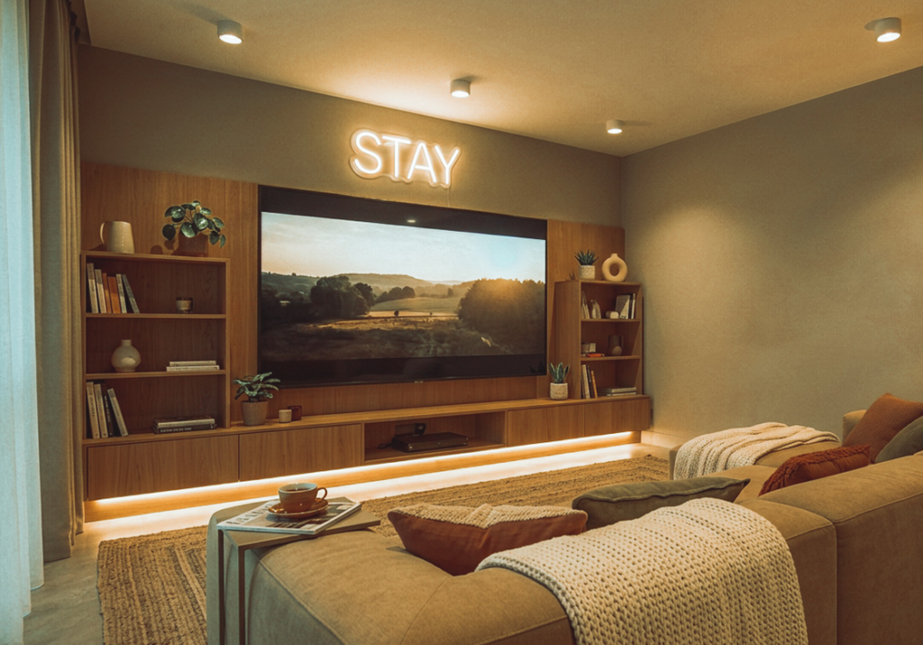
7. Media rooms are the one place where a neon sign can be dramatic
If there’s one room where a neon sign earns the right to be a little extra, it’s the media or gaming room. One strong sign works. Five signs, RGB strips, backlit shelves, and a glowing desk all at once? That’s not design; that’s visual caffeine.
Use a single statement sign to anchor the room, then let the rest of the lighting stay supportive. Deeper tones and warmer accents can make the space feel pulled together without overwhelming the screen.
A softer glow also reduces the harsh contrast between a bright screen and a dark room when it’s set correctly. LED neon’s energy efficiency and long operational lifespan make it much more practical for extended evening use than traditional glass neon.
But once reflections start appearing on the TV, the sign has crossed from atmospheric into annoying.

8. Shelves and niches are where the neon sign gets quietly clever
Some of the best neon installations aren’t the obvious ones. Built-in shelving, arched niches, and recessed display areas can all benefit from a subtle line of neon that creates a soft halo behind objects or along the edge of a surface.
This is where the neon sign begins to behave more like architectural lighting than décor. It frames ceramics, books, or collected objects without becoming the main attraction. LED neon flex is especially useful here because it bends around curves and follows edges more easily than rigid fixtures can.
Used properly, this kind of installation feels considered rather than flashy. There is one honest downside, though. Once shelves are illuminated, clutter becomes very visible. A neon sign won’t create a mess. It will absolutely expose one.
9. Neon sign and art can work together if one knows their place
Pairing a neon sign with wall art can look brilliant or completely chaotic. There is rarely a middle ground. The safest approach is to let the artwork stay in charge while the neon plays a supporting role.
That might mean using a slim line drawing that echoes a shape in a painting, or choosing a small sign that pulls one color from the surrounding pieces. In hallways, dining spaces, or gallery-style walls, that relationship adds depth, making the whole composition feel more alive.
Because LED neon signs are lighter and easier to mount than traditional glass neon, they’re generally more adaptable for layered wall arrangements.
What rarely works is forcing text over already busy artwork, unless the whole room is built around that graphic attitude. Restraint almost always looks smarter. A room doesn’t become more sophisticated simply because more things are glowing at once.
10. Architectural lines make neon look expensive
The most refined use of neon often involves no words at all. Instead, it traces the architecture: an archway, a stair edge, a ceiling recess, a niche, turning the shape of the room itself into the feature.
This approach works because it respects the interior first. Rather than hanging a sign on a finished room, it uses light to reveal what is already good about the space. Flexible LED neon suits this kind of application well; it follows curves and long runs while staying cool and operating at low voltage.
It also integrates cleanly with dimmers and lighting controls, giving homeowners real flexibility between functional light and evening ambiance.
There is one catch, of course. This kind of neon needs planning. Transformers, wiring routes, and clean detailing don’t magically solve themselves, no matter how persuasive the Pinterest board may be.
The glow only works when the room is already working.
Neon signs in home interior design work best when they respond to the room instead of trying to rescue it. That’s the real dividing line. In a well-composed space, neon adds personality and depth, and a bit of edge. In a weak room, it just highlights the weakness in a brighter color.
For homeowners and designers, the smartest move is treating a neon sign as part of a broader lighting and styling plan, not a last-minute decorative fix.
When the sign is sourced from an LED neon sign company, it should be chosen the way any good design element is: with attention to scale, finish, and placement, and with a clear sense of how it actually fits with everything else in the room. That’s when neon stops looking like a trend and starts looking like taste.